Pantone or how to find the perfect color for a project


The history of the creation of the international system of colors and its impact on our lives. Why Pantone is so important in design.
I think each of us has argued with someone about the shade of color at least once in our lives. If for someone a tulip leaf is bright green, then someone sees it richly light green, and for someone, it generally gives off yellowness. And if this problem is not so serious in everyday life, then imagine how difficult it is to explain the right shade of color in the workflow. How to explain to the wedding organizer in what colors it should be decorated, or how to order the color of the furniture, buy paint for the walls? Herbert Lawrence took care of these issues in the middle of the last century. And then I firmly decided to create a color system that the whole world would use.

How was Pantone created?
Mr. Lawrence, working in the printing industry, repeatedly faced the fact that he could not explain to the customer what color would come out when printing. Here it is worth explaining that the color on the screen and the color on paper are two completely different colors. Why? Well, at least because the paper reflects light, and the monitor glows. In addition, the monitor may not be calibrated, or it is not wide-ranging, which means that it does not display some colors.
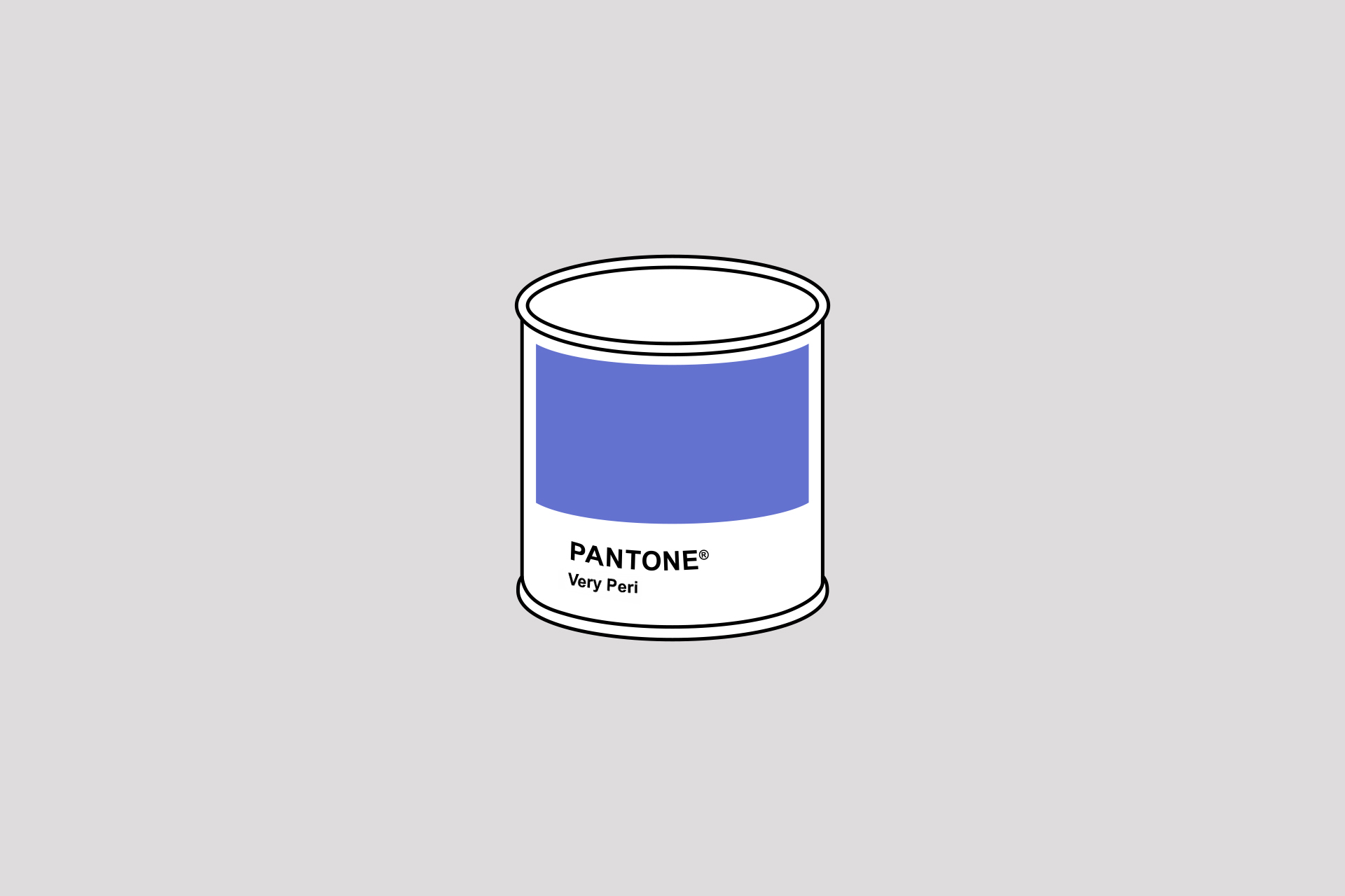
So, going back to Mr. Lawrence. He came up with the idea of printing out some colors and showing them to the customer. And then he was struck by a brilliant idea – to create a standard catalog of flowers. In 1962, Mr. Lawrence bought Pantone and released the first color guide. There were only ten tones in it, but they showed how convenient the system is. Each shade was signified by a number, which means that customers, designers, and printing specialists from all over the world could finally understand each other.
Now the main palette of Pantone Guides has 1867 colors. But there are also specialized palettes for different areas of design. Paints look different on leather and textiles than on paper and a monitor, so fashion designers and makeup artists use separate Pantone palettes. Even cosmetologists and photographers are interested in the company's products. Pantone has released a complete reference book with shades of human skin colors for them.
You can also work with Pantone digitally. Each color palette has its own RGB and HTML counterparts. The company has been developing this system since 1990. You can see how it works in a graphic editor, or in the proprietary MyPANTONE application. Keep in mind that it will not be possible to objectively evaluate the shade due to the difference in the color rendering of different models of phones and computers. By the way, the company took care of this, too. You can purchase a screen calibrator, which will reduce inaccuracy in the display of colors in life and on the screen to a minimum.
Pantone and printing houses
Let's start from the beginning. The colors you see on the monitor are displayed in the RGB system. This system splits the hue into red, green, and blue colors. That is, the desired color is obtained by superimposing these three primary colors. The colors on paper are the CMYK system. It works on the same principle, but it splits into cyan, magenta, yellow and black colors. Both RGB and CMYK are tied to a specific color creation technique and work only with triad paints.
While the Pantone reference palette allows you to achieve the perfect color and works with mixed paints. Plus, Pantone palettes take into account the density and type of paper, which also affect the original color. Using Pantone also saves you money. If you bring the layout to CMYK, the printing house needs to make several test prints in order to adjust the equipment to the most appropriate color. And this is extra money and time costs. In addition, no printing house wants to explain to the customer why Royal Blue suddenly turned out instead of Cornflower Blue.
Pantone Color Institute
The Pantone Color Institute is a research center that works with color and studies its impact on almost all areas (fashion, makeup, advertising, cinema, etc.). Among other things, the Pantone Color Institute determines the palette of the most trending colors of the year and selects the color of the year.
Of course, these forecasts are based on certain data. The company monitors cultural and social changes, studies trends in the use of certain colors in different fields of activity. Then a number of secret meetings of representatives of national groups are held, at which the final decision is made. That's how one company has a huge impact on all areas of our life and paints it in perfect colors!